So, you've been using Notion to keep your life, projects, or team in check, and you're starting to feel like a data wizard. But let's be honest, sometimes staring at a table full of data is about as exciting as watching paint dry.
Enter Notion charts—the secret weapon that turns your boring databases into dynamic, visual goldmines.
In this guide, we’ll not only cover how to make these charts but also explore how you can use them to supercharge your project management and decision-making processes.
Why Bother with Charts in Notion?
Imagine this: you’re trying to track project timelines, analyze team performance, or just make sense of that colossal dataset you've been nurturing. Sure, you could scroll through endless rows in a database, but why not make your life easier?
Charts in Notion help you transform those dry numbers into actionable insights, making it easy to spot trends, track progress, and make decisions faster.
Why are charts so powerful? Because they take complex data and present it in a way that's easy to digest.
Let’s say you have a project timeline that’s 500 tasks long. You could spend hours reading through each task, trying to figure out where things stand. Or, you could create a simple line chart that shows you the progress over time, instantly revealing any delays or bottlenecks. It’s like having a superpower for your data.
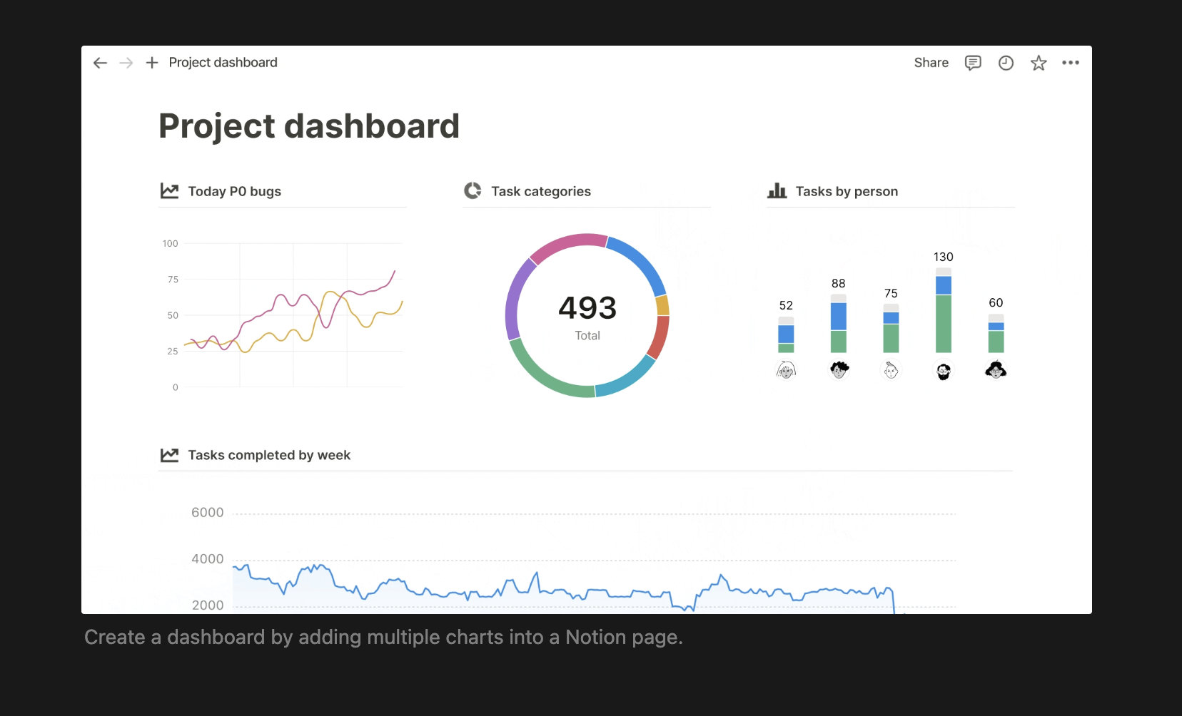
How Your Notion Database Becomes a Chart
Okay, it's not exactly magic, but it's close! Notion lets you create charts just like any other database view. That means your data isn’t locked away in some static spreadsheet—it's alive!
You can switch back and forth between different views depending on what you need to see.
Here’s how you do it:
-
Navigate to Your Database: Go to the page where your data lives. This could be your project tracker, content calendar, or anything else you’re managing in Notion.
-
Create a Chart View: Hit that shiny
-
Customize Away: Filter, sort, and tweak your chart to create the perfect picture of your project's progress. Want a bar chart? Done. Prefer a line chart? Easy peasy.
This flexibility is what makes Notion such a powerful tool for teams. You can visualize the same data in multiple ways, depending on what you need to focus on. Need to see how your tasks are distributed across team members? Use a donut chart. Want to track progress over time? Line chart to the rescue.
Check this Notion doc to learn more.
Types of Notion Charts
Notion charts aren’t one-size-fits-all. You’ve got options, friend:
Donut Charts: Perfect for when you want to visualize the distribution of tasks or resources. Imagine seeing how evenly (or unevenly) tasks are spread across your team in a sprint. Voilà, resource allocation made easy!
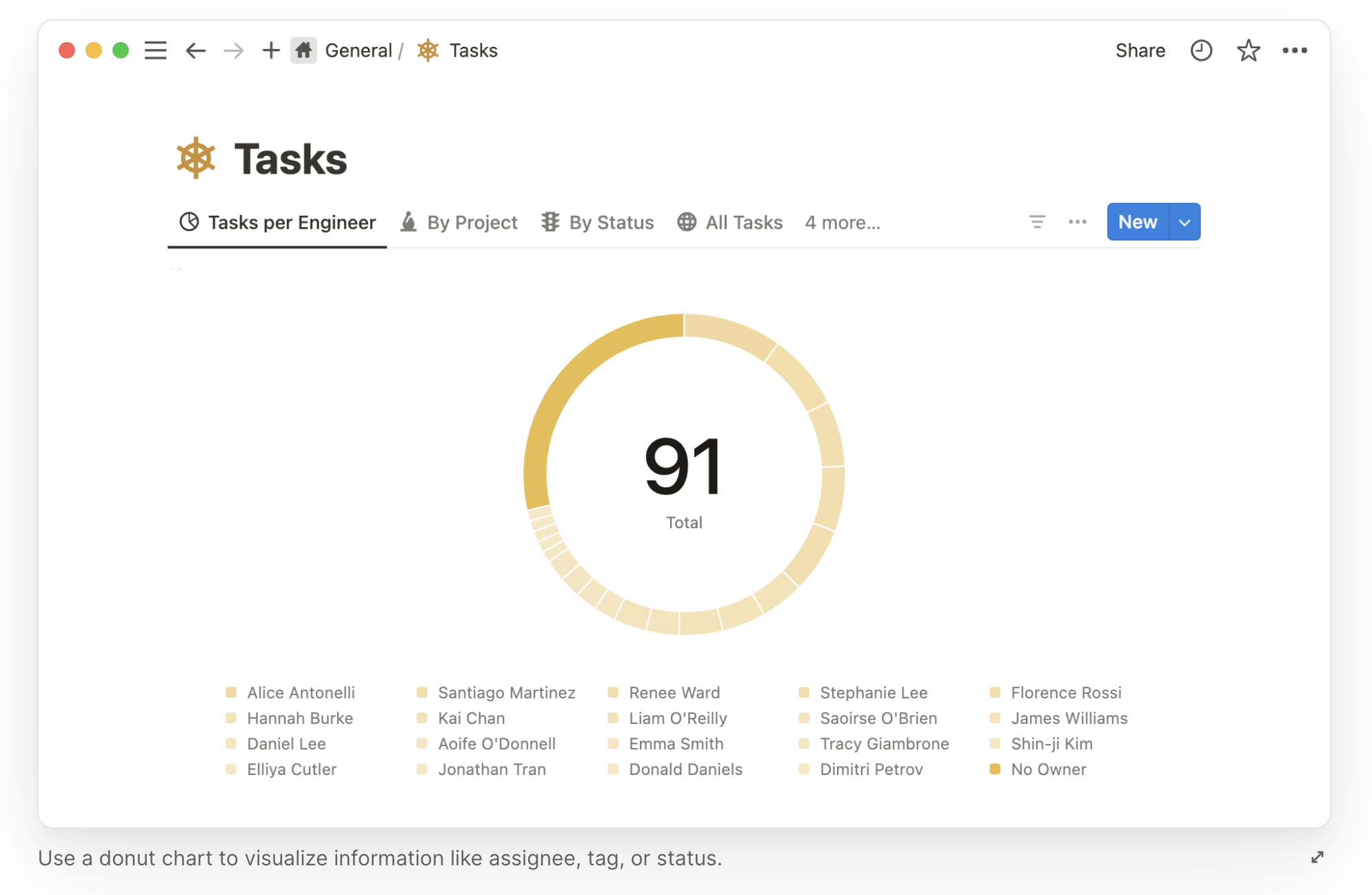
Donut charts are especially handy when you need to see how different segments of your project are coming along. For instance, if you're managing a marketing campaign, a donut chart can show you how tasks are split between content creation, social media, and email marketing. You can quickly spot if one area is lagging behind and reassign resources as needed.
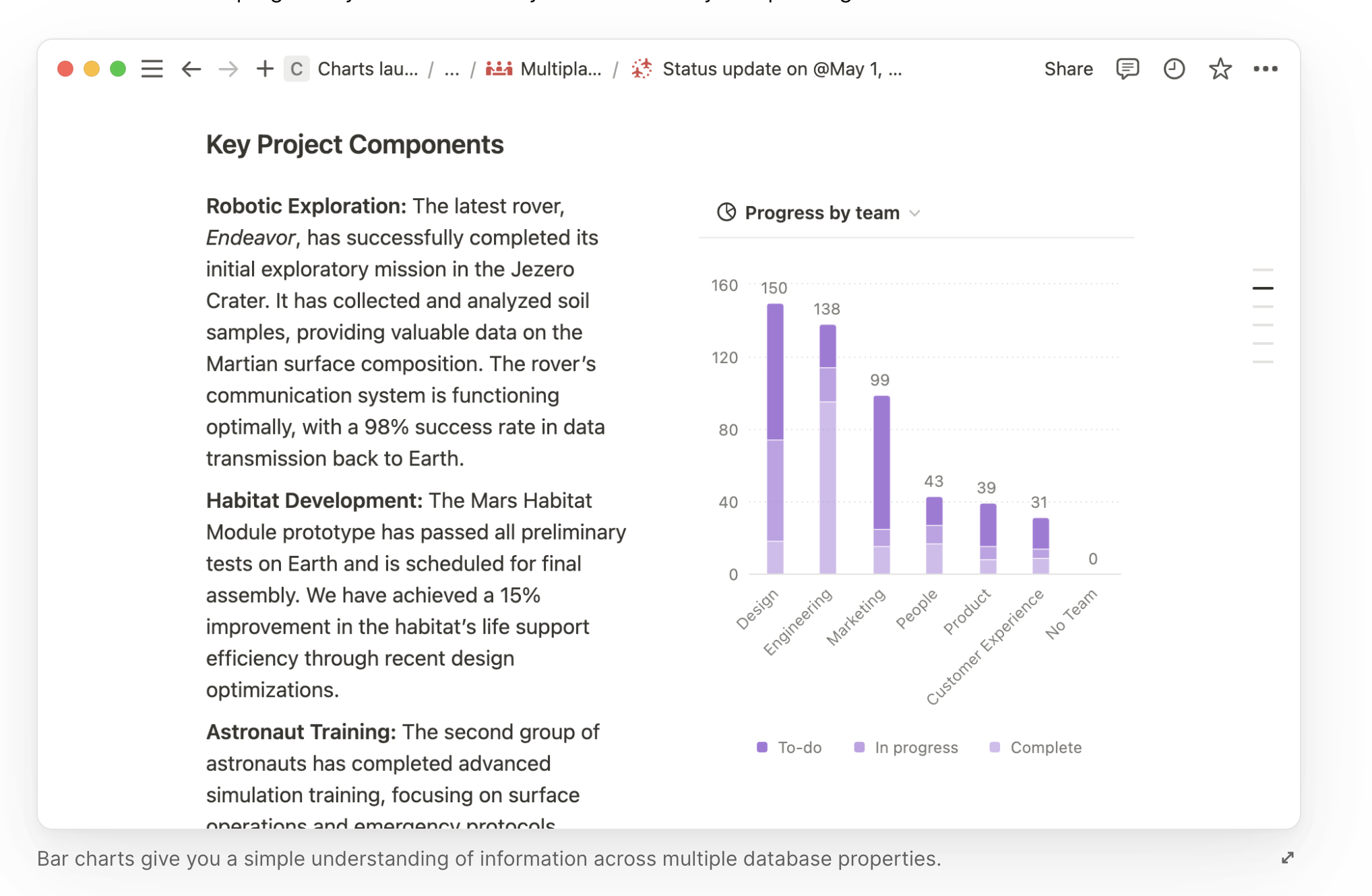
Bar Charts: When comparing categories, bar charts have your back. Whether you’re tracking OKRs by team or figuring out where the bottleneck is in your process, bar charts give you a clear, visual breakdown. Imagine you’re managing a product launch, and you want to compare the progress of different teams—design, development, and marketing.
(Source: Notion doc)
A bar chart can show you at a glance which team is on track and which might need a little extra help. Plus, they’re great for presentations when you need to communicate complex data in a simple way.
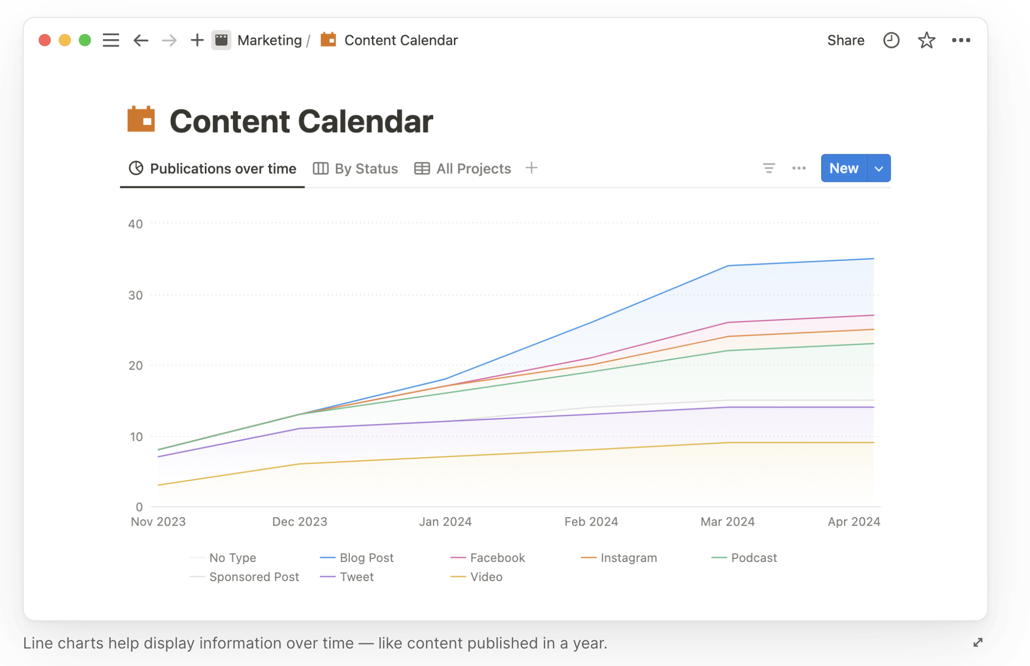
Line Charts: Ideal for showing progress over time. Track the number of tasks completed by your team each week, or visualize how many articles you’ve published over a quarter. Progress never looked so good. Line charts are your go-to when you need to see trends over time.
(Source: Notion doc)
Maybe you want to track how your website’s traffic has grown each month, or perhaps you’re monitoring the completion rate of a long-term project. With a line chart, these trends become crystal clear, helping you make data-driven decisions without breaking a sweat.
These charts aren't just pretty—they're powerful. You can sort and filter data, add labels, and even customize your color palette.
And guess what? The charts update automatically as your data changes. No more tedious copy-pasting or importing data into other tools.
Creating a Dashboard for Notion Chart
Now, let’s take it up a notch. You can combine multiple charts into a single dashboard, creating a visual command center for your projects. This is especially handy if your team uses multiple databases. Imagine a single page where you can see the status of every project, from marketing campaigns to engineering sprints, all in one place.
Dashboards are where the magic really happens in Notion. Because Notion is a connected workspace, these dashboards are living documents. They update in real-time as your team progresses, giving you an accurate snapshot of where things stand.
Here are some ideas for dashboards you can create:
OKR Dashboards: Keep leadership in the loop with a clear, visual representation of your team’s OKRs. Use bar charts to track the progress of each key result, or line charts to show trends over time. Leadership will love you for it.
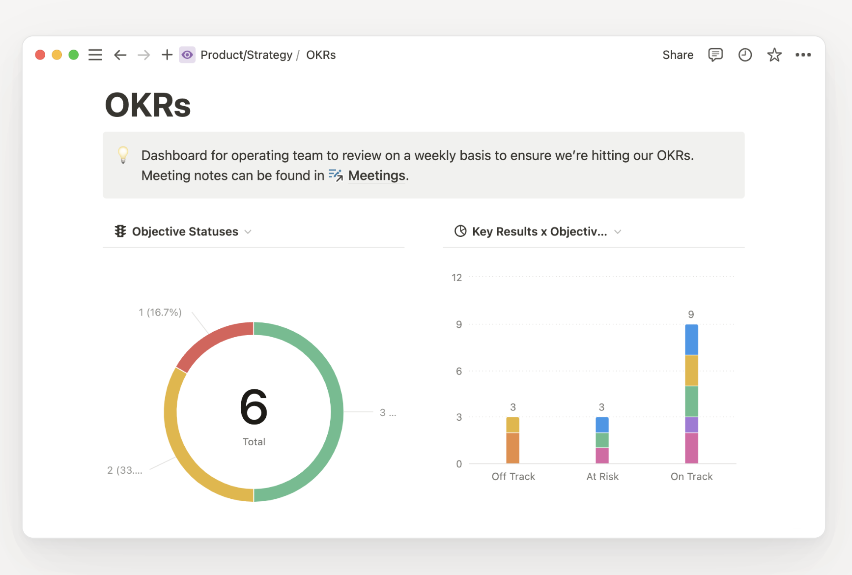
(Source: Notion doc)
A well-designed OKR dashboard can help you spot which teams are on track to hit their goals and which ones might need a bit of extra support. Plus, it makes those quarterly reviews a breeze—you’ll have all the data you need right in front of you.
Do you want to use OKR templates? Check the best Notion OKR templates.
Product Roadmap Dashboards: Want to avoid launch-day panic? Use charts to map out your product’s development schedule. Spot potential bottlenecks before they become problems, and keep your team focused on what’s coming next.
Product roadmaps are critical for keeping everyone on the same page, and with Notion charts, you can visualize the timeline for each feature, track dependencies, and ensure your team is hitting those all-important milestones.
Content Management Dashboards: If you’re managing a content team, charts can help you maintain a consistent publishing schedule. Line charts track your content output over time, while bar charts can show you how well you’re hitting different audience segments.
Whether you’re overseeing a blog, a YouTube channel, or a social media calendar, a content management dashboard can help you keep everything running smoothly. Use it to monitor which topics are resonating with your audience, identify gaps in your content plan, and ensure that your team is staying on schedule.
Get Free Notion Content Calendar.
Advanced Uses of Notion Charts
You didn’t think we’d stop at the basics, did you? Notion charts offer some advanced features that can take your project management game to the next level.
Turn Synced Databases into Charts: If you’re pulling data from tools like Jira, Asana, or GitHub into Notion, you can turn these synced databases into charts. This allows your project manager to get a holistic view of what’s happening across all tools in one glance. Imagine being able to visualize tasks from multiple platforms in a single dashboard—no more bouncing between apps to get the full picture.
Visualize AI-Generated Content Tags: With Notion’s AI autofill, you can generate tags for every row in your database based on page content in seconds. Why not use charts to visualize those tags? This makes for quick exploration of large datasets with very little work to audit and tag your data in the first place. AI might still be in its early stages, but combining it with charts can help you uncover insights that would have taken hours to find manually.
Embed Charts from External Sources: Notion plays nicely with other tools, which means you can embed charts from external data sources like Tableau, Mixpanel, or Google Analytics into your Notion pages. Add these alongside the charts you’re using for project tracking to create a comprehensive view of your team’s performance without leaving the Notion app. This is particularly useful if your team relies on specialized analytics tools but still wants to keep all the visuals in one place.
Final Thoughts
Let’s face it—Notion charts are like the spice in your project management stew. They turn a bland task list into a vibrant, flavorful dish that everyone wants to dig into. So, why not sprinkle some charts into your next project? Your team will thank you, and you’ll look like a data-savvy hero.
But remember, with great power comes great responsibility. Don’t go overboard with charts—too many visuals can clutter your workspace and confuse your team. Stick to what’s essential, and let the data do the talking.
Now, go forth and chart! And remember, if you ever find yourself overwhelmed, just think of your charts as a friendly sidekick, ready to help you make sense of the madness.


